WordPress is amazing because you can build a beautiful website with absolutely no technical knowledge.
There are thousands of free themes available to you right from inside the admin area. 🙂
But what about choosing a theme design?
Which one is best?
The answer is relative to your needs, and will vary from site to site.
I realize the selection process can be overwhelming, but this article will help guide you in the right direction.
Make Note of Your Desired Features
Unless you want to make a bunch of code edits to your WordPress theme after you install it (not ideal for most people), it’s always best to select a theme that has the major features you want out the box.
Do you want a tall header? Do you need a place to display a lot of pictures? How wide should the columns be?
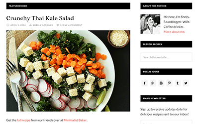
For example, if you have a food website, then you might want a theme that displays large thumbnails on the homepage so you can highlight your dishes.

Or there’s Foodie, which has animated sliders on the homepage. (I’m not a fan of sliders, but hey… to each their own!) 🙂
Make a list of the main features that are most important and search for themes that meet as many requirements as possible. That way you aren’t spending time trying to tweak code.
Yikes!
This is especially true if you go with one of the free themes provided by WordPress. They can be a bit more challenging to customize because they may not give you as many customization options (widgets) via the WordPress admin panel.
I don’t like free themes. I prefer having support and the ability to customize my theme further!
However, if you are on a budget, I can certainly understand why you wouldn’t want to invest in one right away. No worries! There are still some good free themes out there.
Don’t Assume…
Now, when it comes to customizing, don’t ever choose a theme assuming you can easily add or remove a column unless you are a programmer.
Look for themes that let you choose the number of columns or find a theme that has the amount you want.
All StudioPress themes let you choose your number of columns (1, 2 or 3) from the Settings area, which is nice. Their themes have a lot of customization options that make it easy for beginners to edit without knowing how to code.
There’s even a free plugin that will let you add custom text in dozens of different places (before/after the header, before/after sidebar, above the comments, etc.)
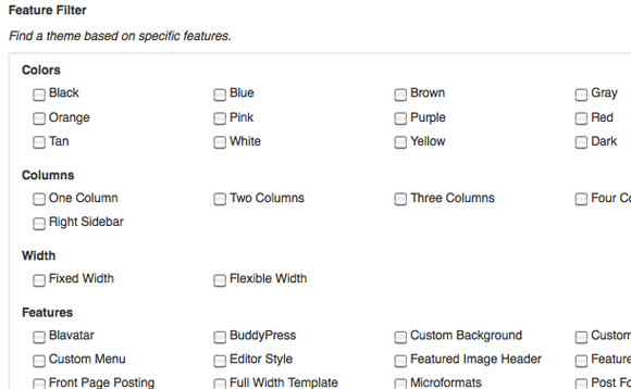
Don’t forget, the WordPress admin panel allows you to sort by specific features you are looking for. When you go to Appearance >> Themes >> Add New, you will find this filter…

Identify The Purpose of Your Site
If collecting email addresses is very important, then you might want to use a theme like the Generate theme by StudioPress.
Or maybe you are creating a wedding site. The Luscious Theme is perfect for feminine sites because of the bright colors.
The StudioPress site does a great job of explaining what kinds of websites their themes are best for so that may help you with your selection. You can see them all here.
Sections Are In!
You’ve probably noticed a lot of websites with “sectioned” homepages.
These are hot right now!
The layout is divided up into blocks that may have different backgrounds as you scroll down.
These themes normally have modern typography, lots of whitespace and larger fonts. They also look great on mobile devices.
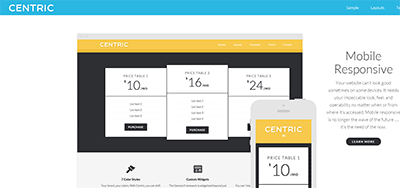
The Centric theme is one of my favorite “sectioned” themes.

Even though the homepage is sectioned off and has one column, the internal pages still have multiple columns.
Many people are giving up on columns altogether, but I still find them useful to highlight important elements and promotions on the site.
The Navigation/Menu
The site navigation is one of the most important parts of a site because it’s how people find your key pages.
Adding additional menus can be tricky if you don’t want to learn PHP, so make sure your theme has what you need before you install.
Many StudioPress themes have menus (above and below the header) and you can turn them on and off very easily in the Menu area. Not all themes are this flexible, so make sure you check on this when shopping around.
And if you need a drop-down menu, you can add those yourself right within the Menu area of WordPress no matter what theme you have.
Nice!
Site Width, Layout & Spacing
Some themes allow you to change the width of your theme or various sections of the site in the control panel, but the majority of them do not unless you want to tweak the code.
For example, if you are going to sell banner ads in the header, choose a theme that has the available banner space like the News theme.
If you know that you want an application/feature that is fairly wide, choose a theme that has larger columns so you don’t have to figure out how to adjust the width later.
Again, always think about the features you want for your site and that will help you choose the right theme for your needs. It will save you major headaches.
As cool as WordPress is, major design customizations require you to understand a bit about CSS and PHP.
Free or Paid?
No doubt your budget plays a role in whether or not you want to go free or premium. As I’ve said many times on this site, I always use premium themes.
The main reason is free themes have little or no support, so when the next release for WordPress is available, it may or may not be compatible.
And if you have any kind of issue with your theme working on the latest WordPress release, it can be very difficult to get any kind of help from the theme creator. In many cases, you may not even be able to find/contact them at all.
Free often comes with a price, so just make sure you understand that if you decide to go that route.
As you can probably tell from reading this article, I’m a huge supporter of the StudioPress Genesis themes. Support is superb and the designs are professional and clean. No, their themes are not flashy. They’re more simple, but fresh.
I ended up buying their All Pro theme package. Now I have access to all their current and future themes. I spent so much money on individual themes over time, it’s actually cheaper in the long run.
You Must Have a Responsive Theme Today
Responsive themes automatically adjust and display favorably when viewed on mobile (smaller) devices.
Search engines like Google favor sites that are mobile responsive over ones that aren’t.
If you’re viewing this site on your phone, you’ll notice how everything displays nicely in one column so you don’t have to pinch and zoom.
The right column drops down below the main column.
If you use WordPress, the easiest way to ensure your site is mobile/friendly is to use a theme that is already coded to be responsive. The good news is most themes are today.
For this site, I’m using the Daily Dish Theme by StudioPress. It automatically adjusts the layout to fit smartphones very nicely.
Need to Setup Your WordPress Site?
If you haven’t launched your website yet, make sure you start here.

