I’m just gonna say it.
My site is almost 15 years old and I’ve NEVER really been that happy with my homepage…
Until now.
First of all, this tutorial section of my site was not running on WordPress for a very long time. So I procrastinated the move, and during that time, I was not inspired to do much with the design.
Thankfully now my blog and this tutorial part of 2 Create a Website are both running on WordPress, so there are no more excuses for a bad design, right? 🙂
Anyway, I took full advantage of the Visual Composer plugin, and re-designed my entire page from scratch.
The Results?
Not only has it drastically increased my opt-in rate (I’m talking about 5x’s better than before), but my affiliate income has increased too.
The purpose of your homepage is NOT to highlight everything you’ve written or content YOU think is great.
It’s about…
- Defining who your site is for
- Making it more personal
- Keeping call to actions to a minimum
Who Is Your Desired Visitor?
Unfortunately too many people start their sites without even considering much about who the desired visitor is.
Don’t assume people are going to hunt and peck around until they find what they want.
If you haven’t decided WHO you are building your site for, it’s going to make converting email opt-ins and sales very difficult.
People should not have to guess or wonder what your site is about after viewing your homepage. It should be blatantly obvious.
When I launched 2 Create a Website in 2002, this site was very focused.
It only taught how to start a website, HTML, CSS and WordPress. Then once I started learning SEO, making money, etc. I began putting out a lot of different types of content on my blog and YouTube.
This helped grow my following tremendously, but my audience and email list was starting to get more scattered.
So while I’ll continue to keep my blog, podcast and YouTube channel for generic Internet marketing and WordPress tips, this tutorial section of my site is going back to the basics.
This main site is for DIYers who want to create and customize their site with WordPress. Period. End of story.
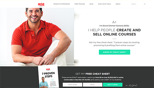
My homepage clearly states that, and so do the menu options in the navigation.
Don’t Give People Too Many Choices on Your Homepage
Limit how many things you ask people to do.
Decide what is most important and focus on that. If you tell people to do too much, they’ll do NOTHING.
I HATE The Blog Post-Only Homepage
I’ve been screaming about this for years now, and I continue to hold my stance.
I know that many bloggers use this format, but I think it’s a mistake — especially for how-to sites.
Here’s an example…
Let’s say you discover a great YouTuber who does videos on gardening. And you finally decide to pay her site a visit.
We’ll pretend that you are a wanna-be gardener, and you’re looking to learn how to start.
Imagine showing up to her homepage and seeing 10 posts streaming down the page:
- One post is about her finger accident with the shears.
- Another one is about her new tomato plant.
- A third one is about getting rid of pests.
These posts are fine for her seasoned audience that is familiar with her brand and content.
But what about you?
At this point, you don’t care about her hurt finger, buggy garden or her budding veggie plant!
You just want to learn how to START a garden. This is a missed opportunity to tell people how she can help them and perhaps get you on her email list! You might not ever return because you didn’t get the help you needed.
So only highlighting your posts on the homepage and not adding any type of introductory content for first-time visitors is a mistake.
Why do you think so many bloggers are now ditching the cluttered homepage approach and moving to the more streamlined, introductory format?

It’s because they grow your email list and convert much better!
So if you do nothing else today, spend some time on this…
- Figure out who your site is for and make sure you homepage reflects that
- Don’t give people too many choices and links to click. You’ll paralyze them.
- Add a large photo to your homepage to make it more personal.
Do these 3 things alone, and they will make a world of difference.
If you want to take my course to learn how to use WordPress to create better pages, click here.

