The homepage is the most important page on your site.
It’s how your site says “hello” to the world. Here are a few ways to make it more inviting.
1) Add a Photo
I remember when adding a picture on your website was considered so taboo.
Years ago people asked me, “You ACTUALLY put your FACE on your site for the world to see?”
My oh my how things have changed. Now people share EVERYTHING online.
Geez. 🙂
But seriously, now it almost looks strange if you DON’T have a picture on your site.
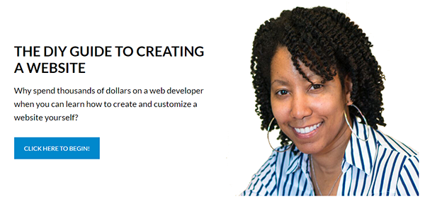
The Internet has become insanely personal thanks to social media, and adding a photo subtly conveys trust.
Use A Plugin
If your theme does not have a spot for your photo on your homepage, you can use a design plugin.
I created my homepage with a drag and drop visual editor called Visual Composer. You can easily add columns and rows within a post/page while keeping your site container intact.
I simply added a two-column row with my picture on the right and text on the left.

Without the plugin, I would have had to use CSS code to lay it out that way because my theme doesn’t have a layout like this.
Thank goodness for WordPress plugins!
2) Don’t Talk About Yourself
Your homepage is not about you. It’s about your visitor and what THEY need.
If you really want to tell your visitors about you, save it for your About Me page. People who are interested enough will eventually make their way there.
A new visitor is only concerned with how YOU can help them in the beginning.
Now there is an exception…
If you are an expert or authority in your field, it never hurts to QUICKLY (and I do mean quickly) explain why you’re an authority.
For example, your homepage intro my say…
“My name is Jim and I’ve been playing pro golf for 10 years. Now I’m going to share my expert strategies with you!”
The key is to turn that around and talk about how YOU are going to help them. That’s a lot different than writing 12 paragraphs about how you got started playing golf.
Big difference.
3) Use Lots of White Space
White space is in.
Busy, cluttered designs are out.
Try to use themes that make great use of white space to give your website a cleaner, fresher look.
4) Get To The Point
I used to be the queen of rambling — both in my videos and here on my site.
I love to write and sometimes I get carried away.
But in today’s world where everyone’s attention spans are getting shorter by the month, you can’t dilly dally around.
Get to the point before you lose your audience.

